Best YouTube Thumbnail Size & Design Tips for 2025

Use Movavi Video Suite to edit your YouTube videos!

  • Create complete movies with music and effects
  • Convert and play back media files
  • Burn CDs, DVDs, and Blu-ray discs

By clicking the download button, you're downloading a trial version of the program.*

Edited by Ben Jacklin
10,642

YouTube thumbnail sizes and design may seem like a small detail, but they can make a huge impact on your video's success. In fact, research shows thumbnails featuring human faces get over 920,000 more views on average than those without.

Let's dive into exactly how the best YouTube thumbnail size and design practices can help you crush your channel goals in 2025.

Best YouTube thumbnail dimensions for 2025

When it comes to crafting the perfect YouTube thumbnail image, size matters. The ideal YouTube thumbnail size for 2025 is 1280 pixels wide by 720 pixels tall, with a 16:9 aspect ratio. While you can go as small as 640 pixels wide, 1280 × 720 is the sweet spot for ensuring your thumbnail looks crisp across all screen sizes.

These YouTube thumbnail dimensions give you ample room to create eye-catching designs without overwhelming the frame. For instance, 1280 × 720 thumbnails can comfortably fit a high-quality image, a title, and a logo without looking cramped.

As for file formats, you have three options:

  • JPEG: this compressed format is ideal for thumbnails with complex images and color gradients. Aim for a quality setting of 8 or higher to avoid compression artifacts.
  • PNG: use this format for thumbnails with sharp lines, text, or transparent backgrounds. PNG file sizes tend to be slightly larger than JPEG.
  • GIF: avoid using GIFs for thumbnails unless you're specifically showcasing an animated loop. GIF color palettes are limited and file sizes can balloon quickly.

Regardless of which format you choose, keep your thumbnail file size under 2 MB. Larger files can slow down load times, especially on mobile devices.

Here's a quick comparison of how different thumbnail resolutions appear on various screens:

Thumbnail resolution

Desktop appearance

Mobile appearance

1280 × 720

Crisp and detailed

Clear and legible

854 × 480

Slightly softer

Still legible, but small details may be lost

640 × 360

Noticeably blurry

Text may be difficult to read

Why thumbnails are crucial for clicks & engagement

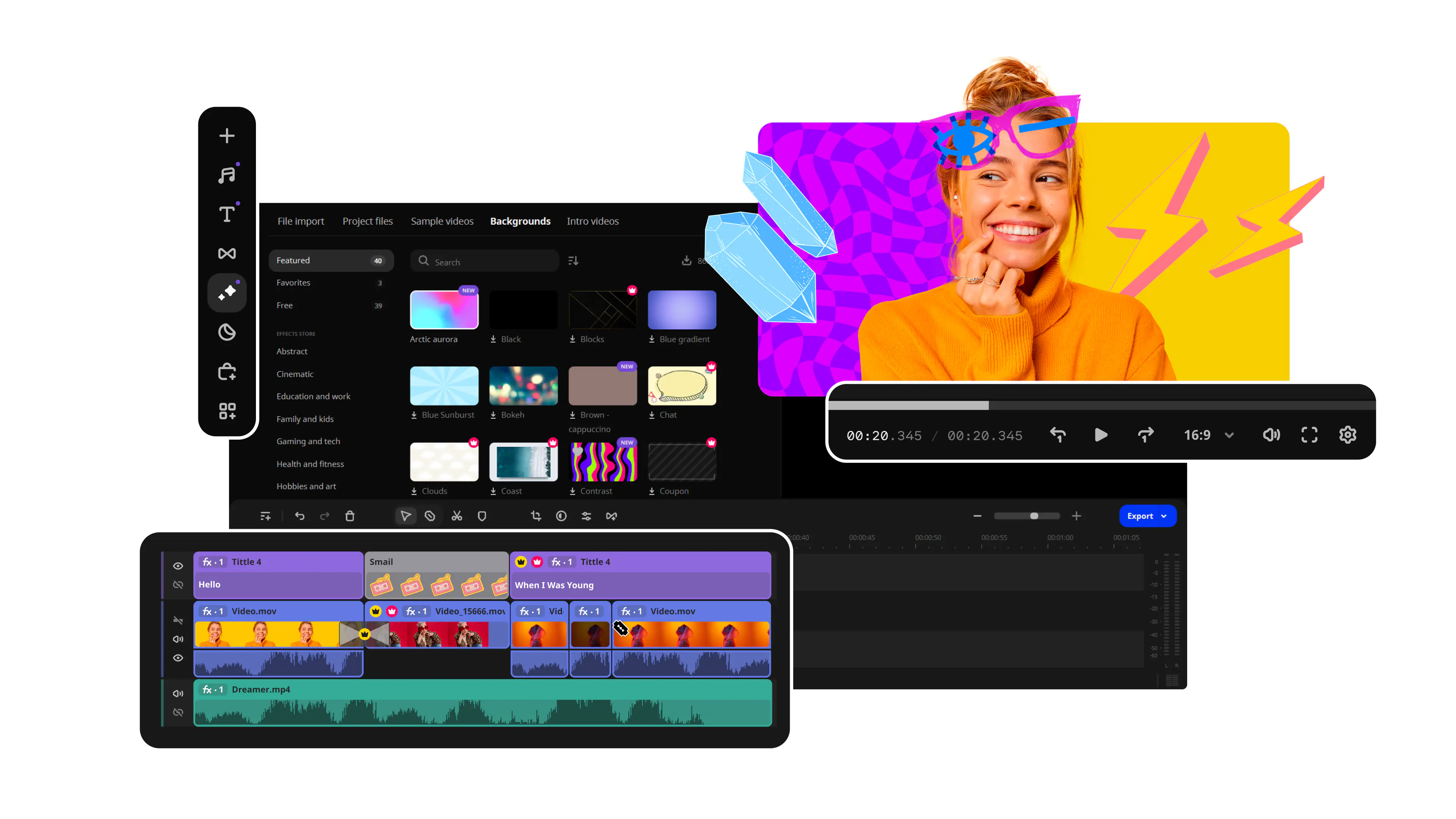
In a sea of search results, your thumbnail is often the first thing potential viewers see. It's your video's "book cover," and it can make the difference between someone clicking through to watch or scrolling right past.

In fact, YouTube reports that video thumbnails are the biggest driver of clicks across all sharing sites. A well-designed thumbnail can increase your YouTube channel's click-through rate (CTR) by up to 30%, even if your video title and description are less than optimal.

That's because YouTube's algorithm heavily weighs user engagement when ranking videos in search results and recommendations. Thumbnails that entice more clicks and longer watch times send positive signals to YouTube, boosting your video's visibility and reach.

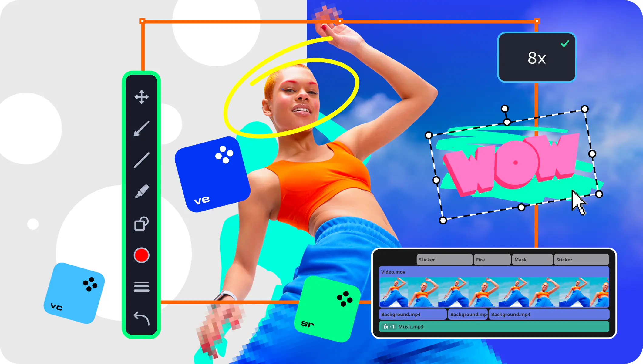
So what makes a thumbnail engaging? It all comes down to psychology. Effective YouTube thumbnail best practices tap into primal emotions like curiosity, excitement, and even fear. They use colors, expressions, and visual cues to convey the video's core message at a glance.

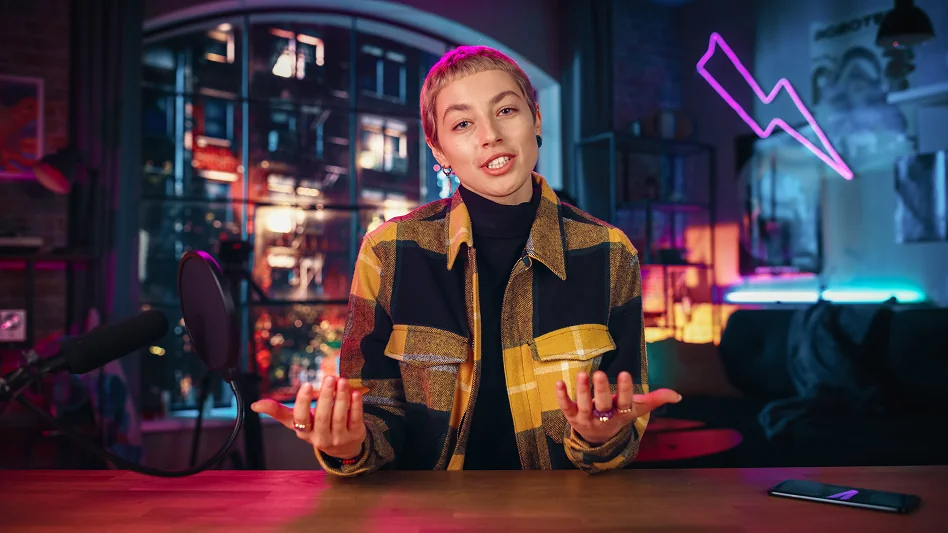
For example, thumbnails featuring close-up faces tend to outperform those without, as humans are hardwired to connect with other humans. Bright, contrasting colors grab attention in busy feeds. And clear, legible text can pique interest by hinting at the video's key takeaway or benefit.

Proven strategies for effective YouTube thumbnails

Creating thumbnail designs that grab attention and compel clicks is equal parts art and science. The best YouTube thumbnails masterfully blend eye-catching visuals with strategic design principles to skyrocket engagement.

Clarity & readability

At its core, an effective custom YouTube thumbnail must be easily readable at a glance. This means prioritizing high resolution images, bold contrasting colors, and clear, legible thumbnail text.

Aim for a text size of at least 36 points to ensure readability on mobile devices. Stick to one or two bold, easy-to-read fonts, and avoid clashing or low-contrast color combinations that can strain the eyes.

For example, white text on a light background or dark text on a busy image will be difficult to decipher. Instead, opt for bright, contrasting hues that make your text pop, such as white on black or yellow on blue.

Color psychology & branding

The colors you choose for your thumbnails can have a profound impact on viewer perception and emotions. Warm colors like red and orange tend to evoke excitement and urgency, while cool tones like blue and green convey trust and relaxation.

Consider your brand's existing color palette when designing thumbnails to reinforce brand recognition and consistency. Incorporating your brand colors strategically can help your thumbnails stand out in a sea of search results while also building familiarity with your viewers.

Using faces & emotions to increase CTR

Humans are hardwired to connect with other humans, which is why featuring expressive faces in your thumbnails can significantly boost your click-through rate. Close-up shots of faces expressing strong emotions like surprise, joy, or even fear can instantly grab a viewer's attention and pique their curiosity.

In fact, thumbnails with human faces have been shown to increase clicks by up to 30% compared to those without. When incorporating faces, aim for variety in emotions and angles to avoid coming across as repetitive or staged.

You can even use arrows or other visual cues to direct the viewer's eye toward the face, further emphasizing the human element and drawing them into the story your thumbnail is telling.

Consistency & branding in thumbnails

Finally, maintaining a consistent visual style across all your thumbnails is key to building a recognizable brand on YouTube. Develop a cohesive template or theme that incorporates your brand colors, fonts, and logo placement, and stick to it for every video.

For example, look no further than YouTuber Casey Neistat. His thumbnails consistently feature a close-up shot of his face making an exaggerated expression, overlaid with bold, all-caps text in his signature font. As a result, Neistat's YouTube video thumbnails are instantly recognizable and have become a key part of his brand identity.

Trending YouTube thumbnail design strategies for 2025

Minimalist vs. bold design

Minimalist thumbnails prioritize clean, simple layouts with ample negative space, often featuring a single focal point or a limited color palette. The goal is to create a sense of calm and clarity that draws the viewer's eye to the most important element.

On the other hand, bold thumbnails embrace loud, high-contrast designs with vibrant colors, strong typography, and dynamic compositions. These attention-grabbing thumbnails aim to stop scrollers in their tracks with an in-your-face approach that demands to be noticed.

So which style is right for your channel? The answer depends on your niche, audience, and brand personality. For example, a minimalist approach might work well for a meditation or yoga channel, while a gaming or extreme sports channel may benefit from a bolder, more energetic style.

AI-generated thumbnails: Should you use them?

With the rapid advancement of artificial intelligence, it's no surprise that AI-powered tools are making their way into the world of thumbnail design. These tools use machine learning algorithms to analyze your video content and automatically generate custom thumbnail images based on key elements like facial expressions, text overlays, and color schemes.

The benefits of AI-generated thumbnails are clear: they can save time, remove the guesswork from the design process, and even optimize for specific metrics like click-through rate. However, there are also potential drawbacks to consider.

For one, AI-generated thumbnails may lack the personal touch and brand consistency that comes with manual design. They may also struggle to capture the nuance and context of your video content, resulting in generic or irrelevant thumbnails.

Thumbnail A/B testing for better performance

No matter how much time and effort you put into crafting the perfect thumbnail, there's always room for improvement. That's where A/B testing comes in. By creating multiple variations of your thumbnails and testing them against each other, you can gain valuable insights into what resonates with your audience and optimize for better performance.

To conduct an effective A/B test, start by identifying a specific element to test, such as the YouTube thumbnail ratio, text placement, or color scheme. Create two or more variations of your thumbnail, changing only the element you want to test while keeping all other variables consistent.

Upload your video with each thumbnail variation and monitor your analytics closely. Look for differences in key metrics like click-through rate, watch time, and audience retention. Once you have enough data to draw conclusions, implement the winning variation and move on to testing the next element.

How to track & improve thumbnail performance

The go-to tool for monitoring thumbnail performance is YouTube Studio. This powerful analytics dashboard provides valuable insights into how your thumbnails are driving clicks, views, and overall video's performance.

To access thumbnail-specific metrics, navigate to the "Reach" tab in YouTube Studio and click on the "Impressions" card. Here, you'll find data on profile picture views and thumbnail impressions, along with key stats like click-through rate (CTR) and average view duration.

Pay close attention to your thumbnail CTR, as this metric directly reflects how effectively your thumbnails are enticing viewers to click. A low CTR may indicate that your thumbnails are not catching viewers' attention or accurately representing your content, while a high CTR suggests that your thumbnails are doing their job well.

To put your CTR into context, consider these average benchmarks for different thumbnail styles:

Thumbnail style

Average CTR

Talking head

2-4%

Text-heavy

3-5%

Animated/GIF

5-8%

Custom graphic

6-9%

Keep in mind that these benchmarks can vary widely depending on your niche, audience, and YouTube's algorithm. Use them as a general guide, but always strive to outperform your own past results.

One channel that successfully optimized its thumbnails based on performance data is Yoga with Adriene. By analyzing thumbnail analytics in YouTube Studio, the channel team noticed that thumbnails featuring close-up shots of Adriene's face tended to have higher CTRs than those with wider shots or text-heavy designs.

Armed with this insight, they began incorporating more close-up facial thumbnails and saw an immediate uptick in CTR and overall view count. They also experimented with different color schemes and found that thumbnails with calming, muted tones outperformed those with bold, contrasting colors.

By continually tracking thumbnail performance and making data-driven adjustments, Yoga with Adriene was able to boost its average CTR by 3% and grow its channel subscribers by 25% in just six months. This goes to show the power of leveraging analytics to inform your thumbnail design strategy.

Common YouTube thumbnail mistakes to avoid

In the quest to create a YouTube thumbnail that stands out, it's easy to fall into common design traps that can ultimately hurt your video's performance.

One of the most prevalent thumbnail pitfalls is using low-resolution images. Not only do low-res images look unprofessional, but they can also give the impression that your video content is similarly low-quality. When selecting an image for your thumbnail, always opt for the highest resolution version available. If you're using a preview image from your video, choose a frame that's clear and in focus. If you're creating a custom graphic, use vector images and high-res photos to ensure your thumbnail looks crisp across all devices.

Another common mistake is poor contrast between thumbnail elements. If your text and key visuals are difficult to distinguish from the background, viewers may scroll right past your video without a second glance. To avoid this issue, use bold, contrasting colors for your text and graphic elements.

Perhaps the most egregious thumbnail mistake is using misleading images that don't accurately represent your video content. While it may be tempting to use a shocking or provocative image to garner clicks, this approach will only hurt your channel in the long run.

Final thoughts & key takeaways

As we've explored throughout this guide, mastering the art of YouTube thumbnail creation is a critical skill for any content creator. From understanding the perfect YouTube thumbnail size to leveraging eye-catching graphic elements and staying ahead of design trends, there's no shortage of strategies to help your videos stand out and drive clicks.

To help you stay on track, here's a checklist of best practices to keep in mind as you create your YouTube thumbnails:

  • Use the recommended 1280 × 720 pixel thumbnail size for optimal clarity and compatibility

  • Select high-resolution, visually compelling images that accurately represent your video content

  • Incorporate bold, contrasting colors and legible text to make your thumbnails pop

  • Leverage the power of human faces and emotional expressions to connect with viewers

  • Maintain a consistent visual brand across all your thumbnails for easy recognition

Movavi Video Suite

Everything you need to create and edit multimedia files

*The trial version of Movavi Video Suite has the following restrictions: 7-day trial period, watermark on exported clips, 60-second video or 1/2 audio length limit, and/or some advanced features unavailable when exporting videos.

Movavi Video Suite

Frequently asked questions

What is the ideal size for YouTube thumbnails?

The recommended size for YouTube thumbnails is 1280 pixels wide by 720 pixels tall, with a minimum width of 640 pixels. This 16:9 aspect ratio ensures your thumbnail looks great across all devices and platforms.

What is the maximum file size for thumbnails?

The maximum file size for YouTube thumbnails is 2 MB. If your thumbnail exceeds this limit, you may need to compress the image or save it in a different file format.

Have questions?

Have questions?

If you can’t find the answer to your question, please feel free to contact our Support Team.

Join us for discounts, editing tips, and content ideas

1.5M+ users already subscribed to our newsletter

By signing up, I agree to receive marketing emails from Movavi and agree to Movavi's Privacy Policy.